
Behind The Project
This design was a project that was only supposed to be home page, it was created to be able to express my own design skills while still being able to it attractive to its target audience. This was a simple, easy, and fun, design that was a great experience to make.
Design Goals
I wanted the site to feel
- Inviting – soft colors, beautiful images, simple grid use
- Modern – I used lots of editorial layouts, with good spacing, and as minimal clutter as possible
- Easy to Navigate – Great hierarchy, simple products gallery, and intuitive flow
sketches & early concepts
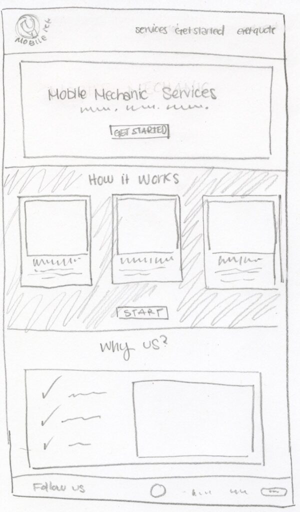
Sketches & Prototypes
Before actually going to Figma for a mockup, I created sketches to get an idea and explore layout ideas and what would where. My first prototypes were very experimental, heavier typography, , and just overall different (kind of similar) style choices. These are sketches and prototypes that ultimately helped me decide on:
- The hero layout
- The order page layout
- Flower bouquet cards in my order page
- Simplify Design and still making it look good
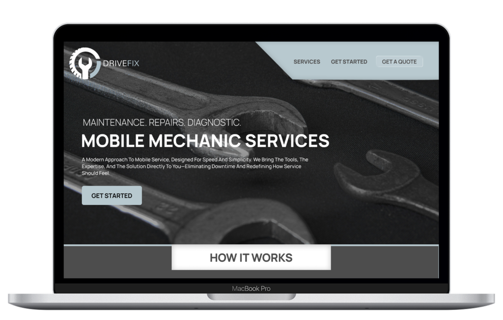
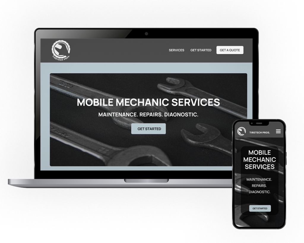
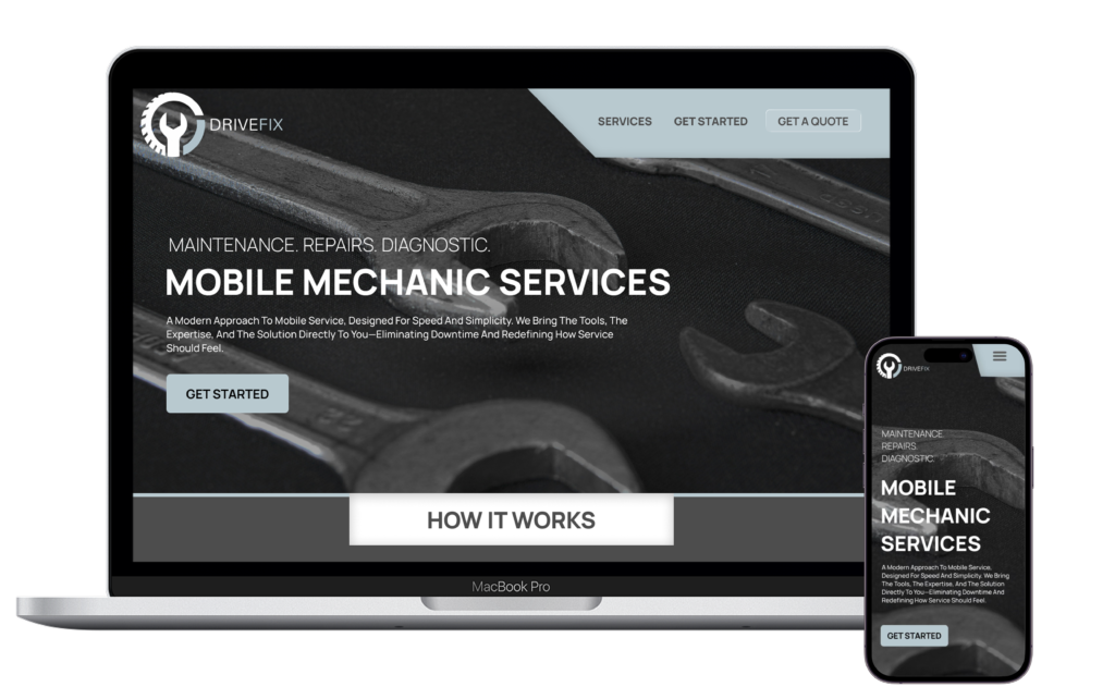
First mockup created
Summary
Building this fictional brand gave me freedom to shape every detail, from the brands visual identity to the pages layout and/or structure. This also helped me be able to make decisions based on usability, visual aesthetic, and target audience. This website really represents me as a deigner and the process that shaped this final version on the website.