
Behind The Project
This concept project is a fully fictional flower-delivery company & brand created for my design portfolio, however even though its fictional, the design decisions, sketches, and problem-solving are real and genuine! Through this project I was able explore new fun and creative designs, using color everywhere I could. These notes will highlight my process, intentions, and thoughts behind this wonderful site.
Design Goals
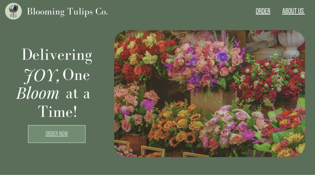
My Intention was to create a soft, colorful, modern, and fun looking website. I went for clean typography, simple UI UX, fun yet not chaotic color palette, to achieve the visual goals I had in mind.
I wanted the site to feel
- Inviting – soft colors, beautiful images, simple grid use
- Modern – I used lots of editorial layouts, with good spacing, and as minimal clutter as possible
- Easy to Navigate – Great hierarchy, simple products gallery, and intuitive flow
sketches & early concepts
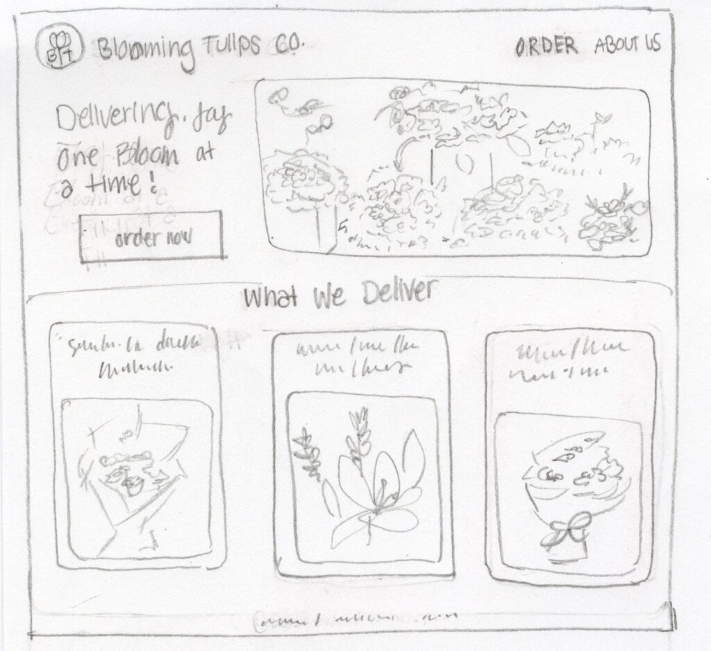
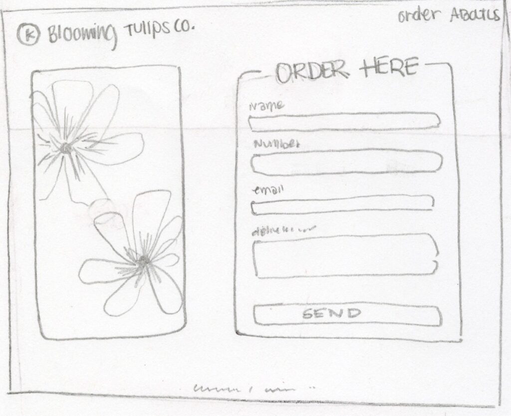
Sketches & Prototypes
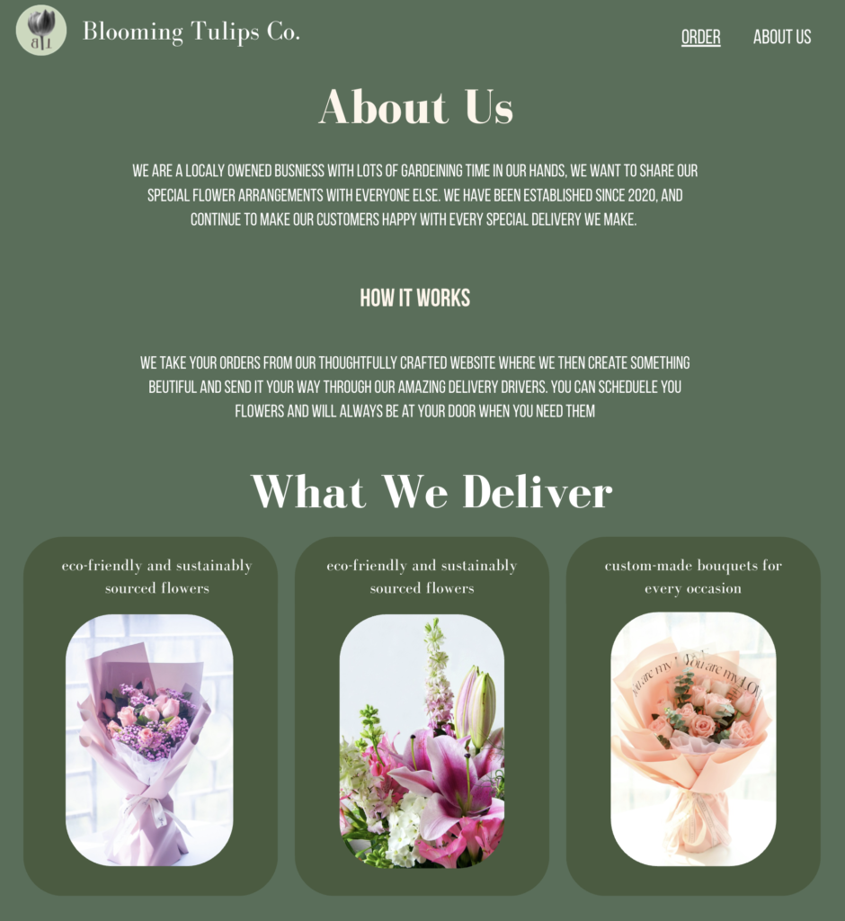
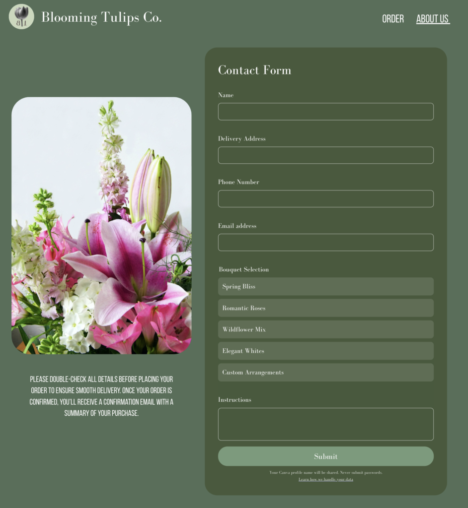
Before actually going to Figma for a mockup, I created sketches to get an idea and explore layout ideas and what would where. My first prototypes were very experimental, heavier typography, , and just overall different (kind of similar) style choices. These are sketches and prototypes that ultimately helped me decide on:
- The hero layout
- The order page layout
- Flower bouquet cards in my order page
- Simplify Design and still making it look good
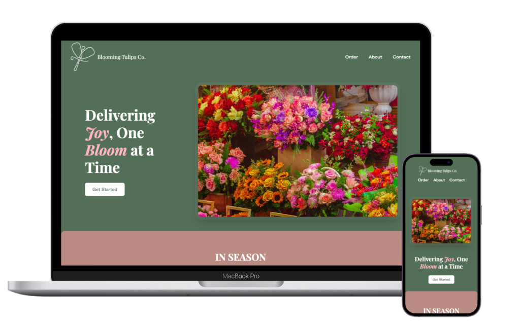
First mockup created
Check it out here!
Summary
Building this fictional brand gave me freedom to shape every detail, from the brands visual identity to the pages layout and/or structure. This also helped me be able to make decisions based on usability, visual aesthetic, and target audience. This website really represents me as a deigner and the process that shaped this final version on the website.